
teatree design
SARA EIDELSHTEIN

Hello,
Art World
Bringing insights and analytics to the art market
scroll


Overview
While I was the lead product designer for the entire MutualArt platform, my main project was to create an analytics suite of decision support tools for the art market.
I worked together with the Head of Product, Data Scientist, Content team, and R&D.
Project timeline: 2017-2018
The challenge
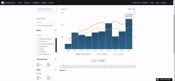
Analytics for the art market is particularly tricky because the art industry is unlike any other. The value of art is subjective and follows different rules. We were tasked not only with being the first analytics platform of its type, but also to create something that is not definitive in it's conclusion. We can say, based on these trends your artwork *may* be worth _____.

Understanding the use case
Together with our insight analyst, we scoped out the functionality of the platform and what questions this platform will answer for our users.
User questions we can answer:
1) How much is my artwork worth?
2) When is a good time to buy/sell?
3) Where can I buy/sell my artwork?
We discussed and whiteboard all variations of graphs and charts that might be a useful visualization of this data. Through this process, we discovered there were more details we could provide in this analytics tool than we initially thought. These were built out in the form of filters, sorting, and search functions that were much more complex.


Wireframing
I don't like to waste time. So after an initial scope, I like to start sketching and build some initial wireframes. This allowed me to come back to product managers and our insights analyst and explain my perspective of the user experience in a clear visual way.
From here, we were able to sit and discuss what was missing, how filters and graph displays can be shown effectively. We were able to discover where there may be UX issues without developing anything. This is a critical step in an agile design process. Iterations need to be made from as early on in the design process as possible so that you don’t find ‘easy’ mistakes at a later stage.

Data visualizations
A major discussion we had post initial mockups was navigation. There was a lot of navigating. From a user perspective, is a 4-tiered navigation too much? It's top heavy. We had to get creative. This early mockup got the boot.
Development
I worked together with a team of 6 developers to build the platform. As things tend to go, issues arise that cannot always be premeditated. You gotta be flexible. As the functionality of the tools came together, we discovered user and data issues that needed some reworking from a design perspective. No room for impatience, just do it.
[Understanding and experience with dev tools is super helpful when you need to explain what you want a developer to do.]


Updating the pricing page
I found this article from InVision about the UX of pricing pages enlightening, particularly the following passage:
“...by far the most common interaction from the home page is to the pricing page. It routinely blows everything else away, including login from existing customers. Every heat map, GA funnel, and behavior recording I’ve analyzed points strongly to broad, perpetual interest in how much a service costs...”
Your customers are either price-focused first or features-focused first. And it’s those price-focused customers we’re worried about most with pricing pages."
-Nick Disabato


The original pricing page vs. the updated pricing page including tables to indicate the benefits of each plan
More MutualArt Designs
 |  | |
|---|---|---|
 |  | |
 |  |  |
